Side Project / Redesigning News site
Mashable
Branding
Objective
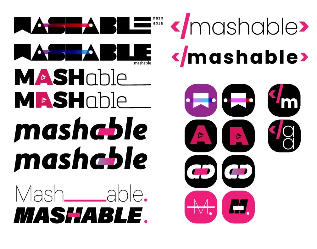
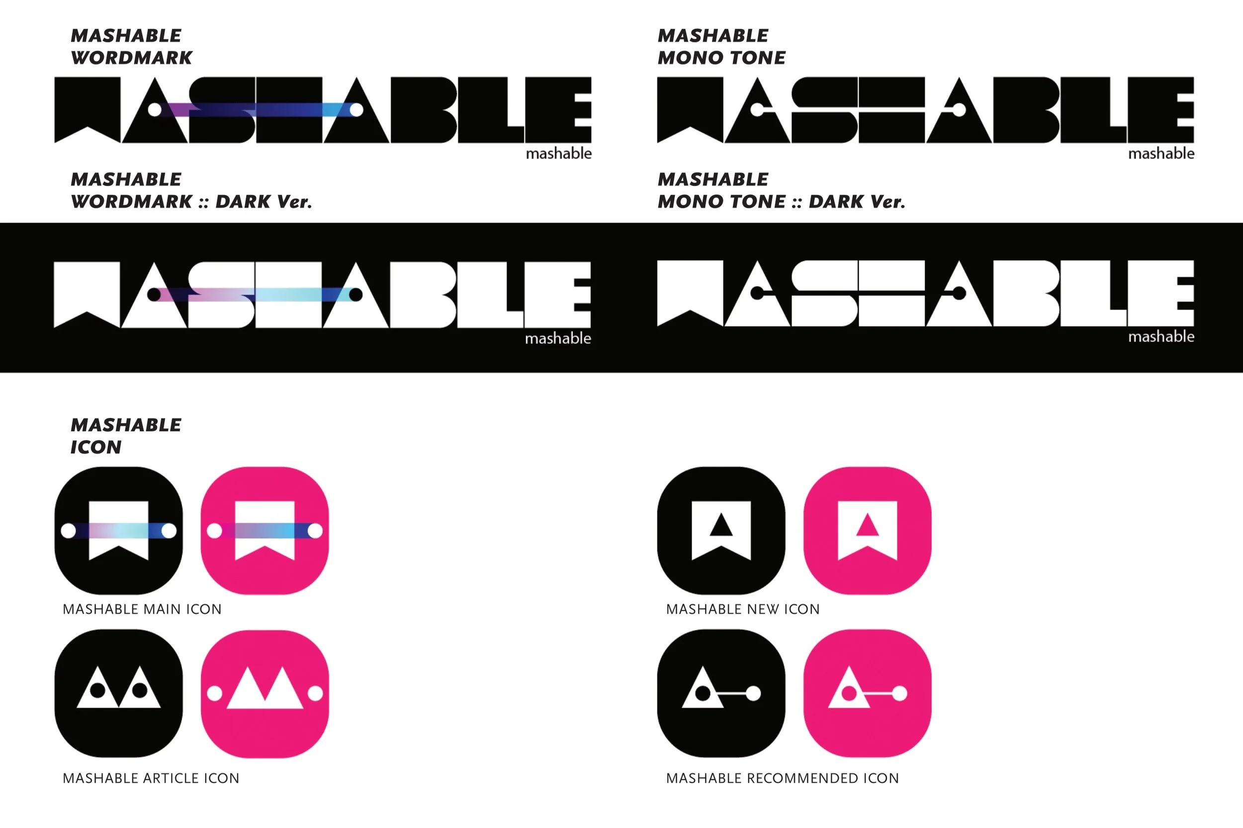
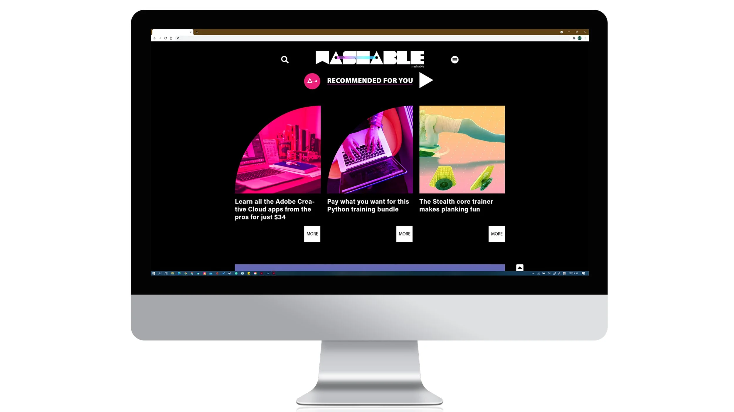
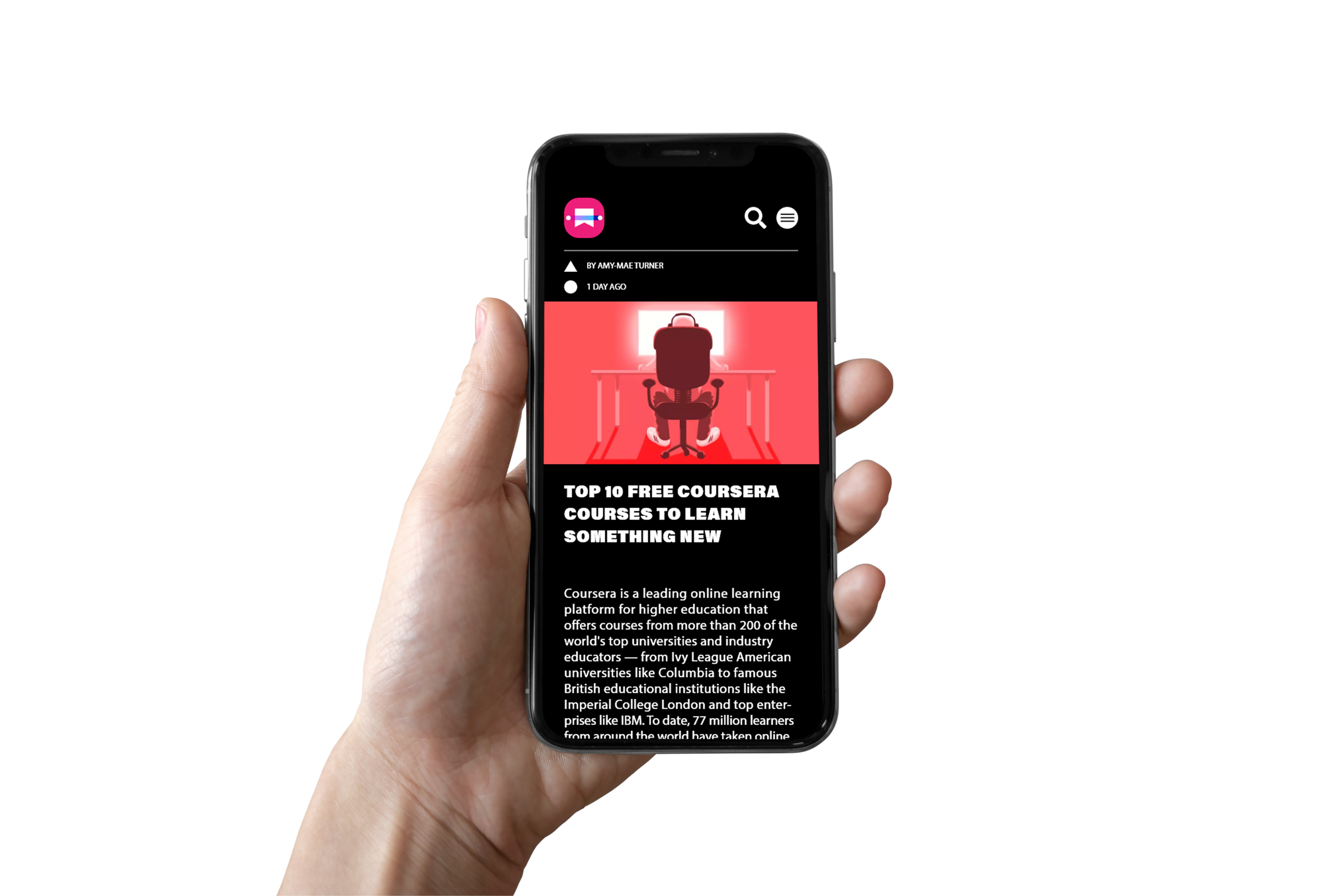
The objective of this project was to create a news website with a strong emphasis on technology, and to design a visual identity that conveyed a sense of modernity and innovation. The use of a square-based font and fluorescent colors aimed to give the brand a high-tech and electronic feel, while the wordmark conveyed the name of the site and its focus on technology and online journalism.
Approach
For my news site, I named it Tech Online Journal Mashable. To create a techno or electronic feeling, I designed a font with square-based shapes and used it for the wordmark. I also incorporated fluorescent colors to convey a high-tech and modern aesthetic.
👇